A lot of small brands launch with a homepage, a shop page, and a vague sense that they will figure out the rest later.
I understand why.
When you are trying to get a business off the ground, extra pages can feel like admin work. They do not feel as urgent as product photos, inventory, packaging, social content, or actually making the thing you are trying to sell.
But this is where a lot of new brands quietly create trust problems for themselves.
Because your website is not just where people browse. It is where they decide whether your business feels complete enough to buy from.
If important questions go unanswered, if the structure feels thin, or if the site makes people hunt for basic information, the brand starts feeling less credible. Not always because anything is wrong, but because too much is missing.
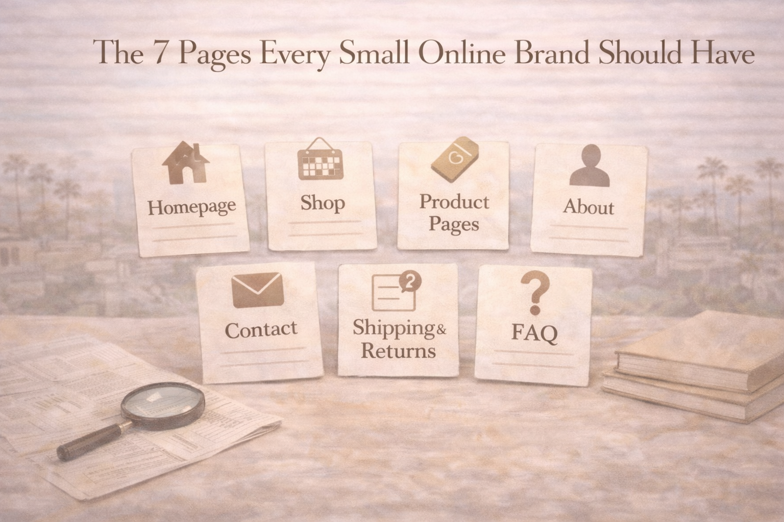
That is why I think every small online brand should have seven core pages in place. Not because there is some sacred website formula, but because these are the pages that usually do the most work when it comes to clarity, trust, and conversion.
1. A homepage that explains what you sell fast
The homepage is not supposed to do everything.
It is supposed to orient people.
That means a stranger should be able to land there and quickly understand what the brand sells, who it is for, and what kind of business they are dealing with. Not eventually. Quickly.
A lot of small brands waste this page by treating it like a moodboard with a menu. The visuals look polished, the copy sounds elevated, but the actual offer is still fuzzy after the first screen.
Your homepage does not need to be loud or literal. It does need to reduce confusion.
At minimum, it should answer a few basic questions:
- What is this brand?
- What can I buy here?
- What makes this worth paying attention to?
- Where should I go next?
If the homepage cannot do that, the rest of the site has to work too hard to catch up.
2. A shop or collection page that helps people browse without getting lost
This is the page a lot of brands technically have but do not structure very well.
A good shop page is not just a grid of products. It is a browsing system. It should help people move through your catalog in a way that feels clear, not cluttered.
If you sell multiple product types, categories should be obvious. If you sell a small number of products, the page should still feel intentional, not empty. If you have collections, they should make sense from the customer’s point of view, not just your internal logic.
This page matters because not everyone enters the site ready to buy one exact thing. A lot of people are still trying to understand the range, the price level, and the overall shape of the brand.
The shop page should help that process, not complicate it.
3. Product pages that answer practical questions before people ask them
If the homepage creates interest, the product page has to earn confidence.
This is where a lot of small brands under-explain. They assume the product speaks for itself, or they rely too heavily on visuals, or they write descriptions that sound nice but do not actually help someone make a decision.
A strong product page should make buying feel easier.
That usually means including things like:
- Clear product photos
- Straightforward descriptions
- Materials, sizing, or usage details
- Shipping expectations
- What makes this item different or worth the price
People do not always email you when a product page is weak. They usually just leave.
That is why this page is not optional. It is the decision layer of the site.
4. An About page that makes the business feel real
I think a lot of small brands misunderstand the About page.
It is not there so you can write your autobiography.
It is there to make the business feel more human, more grounded, and more believable.
That does not mean it needs to be overly personal. It does mean it should help someone understand the brand beyond the transaction. Who is behind it? Why does it exist? What standards matter to you? What kind of business are you trying to build?
The best About pages usually connect the founder story to the business story. They do not just tell me who you are. They help me understand why this brand exists in this form.
That is especially important for smaller brands, handmade brands, creative businesses, and founder-led stores where trust is part of the value.
5. A Contact page that makes it easy to reach a real person
This is one of the easiest ways to look more professional online, and a surprising number of small brands still make it harder than necessary.
Your Contact page should not feel like a scavenger hunt.
If someone has a question before buying, wants help after an order, or just needs reassurance that there is a real business behind the site, this page should make that easy. Not complicated. Not hidden in the footer with no context. Easy.
You do not need ten contact methods. You do need clarity.
That might include:
- A contact form
- An email address
- A response-time expectation
- Relevant business hours if needed
- Links to social channels if those are active support touchpoints
A clear Contact page does not just help with support. It reduces doubt before support is even needed.
6. A shipping and returns page that answers the questions people feel awkward asking
This page does a lot more trust work than most founders realize.
Before someone buys, they want to know what happens if something goes wrong. How long will shipping take? Can they return it? What if it arrives damaged? Do you ship internationally? What happens if they change their mind?
These are not edge-case questions. These are normal buying questions.
If the answers are missing, the site starts feeling riskier. Not because customers expect a problem, but because they want to know the business has thought things through.
Your policies do not need to sound corporate. They do need to be clear. This page should feel like it was written by a competent adult who understands that buying online involves uncertainty and wants to reduce it.
7. An FAQ page that handles friction before it becomes hesitation
A good FAQ page saves customer service time, improves buyer confidence, and helps your brand sound more prepared.
A bad FAQ page is just filler.
The difference is whether the questions are real.
If your FAQ page only includes obvious, generic, or low-value questions, it will not do much. But if it addresses the actual friction points people have before buying, it becomes one of the most useful pages on the site.
That might include:
- How long orders take
- How sizing works
- What materials are used
- How custom orders work
- Whether items are restocked
- How subscriptions, refills, or repeat purchases work
The FAQ page is where you prove the business has heard buyer uncertainty before and knows how to answer it calmly.
Why these pages matter more than people think
None of these pages are exciting in the way a rebrand or a product launch is exciting.
That is part of the reason people skip them.
But these pages are often the difference between a brand that looks nice and a brand that feels trustworthy. They make the site feel finished. They make the business feel easier to understand. They reduce the amount of guessing the customer has to do.
And that matters because most small online brands are not losing sales only because of traffic problems. They are losing some sales because the site still feels incomplete in the places buyers care about most.
What I would check first
If I were reviewing a small brand site, I would ask:
- Can a stranger understand the business from the homepage?
- Is browsing easy?
- Do the product pages reduce doubt?
- Does the About page make the brand feel real?
- Is contact information easy to find?
- Are shipping and returns clear?
- Does the FAQ answer real buyer questions?
If those seven areas are covered well, the site usually starts feeling more complete immediately.
The bottom line
Small brands do not need huge websites.
They do need complete ones.
If your site has these seven pages in place, you are much closer to giving buyers what they actually need: orientation, confidence, and fewer reasons to hesitate.
That is what good website structure does.
It does not just organize information.
It helps the brand feel ready to be trusted.
Leave a Reply